How to create a Simple Card Component using TailWindCSS

• Full Stack Engineer • Auth0Ambassador • Organizer at AngularHive community • Speaker • Blogger
Hello awesome people👋, welcome back.
This blog post is going to be a super simple post, and I just wanna share my TailWind CSS learning with you all.
What are we going to design?
A simple and minimalistic card component with 100% TailWind CSS.
CodePen setup
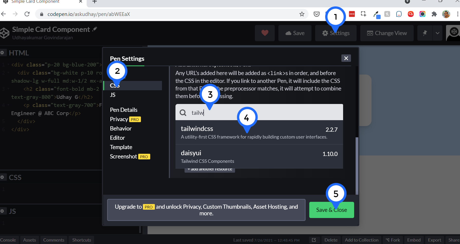
Let's create a new pen in CodePen, and make sure you added TailWindCSS as an external CSS library from Settings as shown below.
Let's design card component
- Step 1: Create a container for the Card component (a div tag obviously) with padding as 20 which is 5 rem and background color with blue shade.
<div class="p-20 bg-blue-200">

</div>
bg-blue-{} - You can pass values from 100 to 800 in multiples of 100, that create different shades of blue color.

- Step 2: Create a card inside the container:
<div class="p-20 bg-blue-200">
  <div>
    <h2>Udhay G</h2>
    <p>Full Stack Engineer @ ABC Corp</p>
  </div>
</div>

Step 3: Let's beautify the card:
Add tailwind css classes to inner div for Background color/ Rounded border/ Box shadow.
<div class="p-20 bg-blue-200">
 <div class="bg-white p-10 rounded-2xl shadow-lg">
   <h2>Udhay G</h2>
   <p>Full Stack Engineer @ ABC Corp</p>
 </div>
</div>
This card looks really big on Large devices, so let's make it responsive. I want to use the full width of the device when the device is small-sized, and use half the width of the device when the device is medium-sized and above.
- These responsive classes do the magic:
w-full md:w-1/2<div class="p-20 bg-blue-200"> <div class="bg-white p-10 rounded-2xl shadow-lg w-full md:w-1/2"> <h2>Udhay G</h2> <p>Full Stack Engineer @ ABC Corp</p> </div> </div>
Uh ho. The card is not center-aligned in medium-sized devices though it uses half the width of the device size, no worries, let's add this class
mx-autowhich will auto-align the div to center.<div class="p-20 bg-blue-200"> <div class="bg-white p-10 rounded-2xl shadow-lg w-full md:w-1/2 mx-auto"> <h2>Udhay G</h2> <p>Full Stack Engineer @ ABC Corp</p> </div> </div>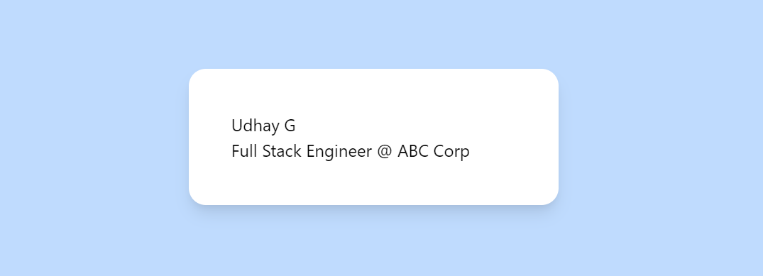
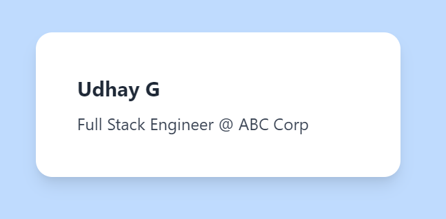
<h2/>- Change the font typography, font size, font color and also add margin-bottom.<div class="p-20 bg-blue-200"> <div class="bg-white p-10 rounded-2xl shadow-lg w-full md:w-1/2 mx-auto"> <h2 class="font-bold mb-2 text-xl text-gray-800">Udhay G</h2> <p>Full Stack Engineer @ ABC Corp</p> </div> </div>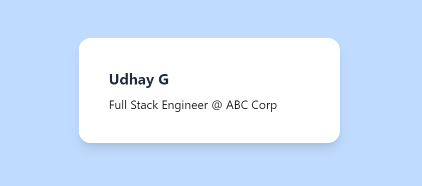
<p/>- Change the font color.<div class="p-20 bg-blue-200"> <div class="bg-white p-10 rounded-2xl shadow-lg w-full md:w-1/2 mx-auto"> <h2 class="font-bold mb-2 text-xl text-gray-800">Udhay G</h2> <p class="text-gray-700">Full Stack Engineer @ ABC Corp</p> </div> </div>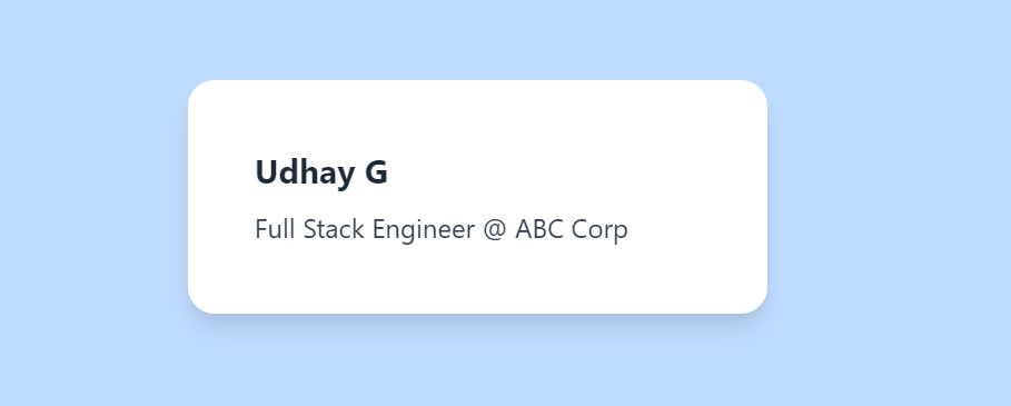
- These responsive classes do the magic:
Demo
All ready you now know how to create a simple card component using TailWindCSS.
Hope you find this article useful, please feel free to share it with your friends/colleagues.
If you got any questions, don't hesitate to post them in the comments section down below.
Happy learning!
I tweet a lot about Web development, Java, and Productivity Hacks, follow me on Twitter at AskUdhay.
Here is one of my recent tweets:
Reference
https://tailwindcss.com/docs


