How to Setup Storybook.js for Angular Material Components
Let's explore how to configure Storybook.js for "<mat-progress-bar>" Angular Material component

• Full Stack Engineer • Auth0Ambassador • Organizer at AngularHive community • Speaker • Blogger
Introduction to Storybook.js
Storybook is an open-source tool for building UI components and pages in isolation. It streamlines UI development, testing, and documentation.
It helps us to develop and demo projects with just components instead of creating the actual pages in a website. Style guide generated using StoryBook has living documentation on how the components work and interact.
Built with
- Angular V12
- Angular CLI V12
- Storybook V6.3
- Node V14.17
- npm 6.14.13
1. Create Angular project
Let's create a new Angular project using the below command:
ng new storybook-ng-material
2. Setup Storybook.js in the Angular app
Run the below command from the root of your project to set up Storybook.js. This is the out-of-the-box support from Storybook.js.
npx sb init
This command identifies the project type, installs @storybook/angular, and adds demo examples.
$ npx sb init

 sb init - the simplest way to add a Storybook to your project.

 • Detecting project type. ✓
 • Adding Storybook support to your "Angular" app npm WARN deprecated ts-simple-ast@12.4.0: NOTICE: ts-simple-ast has been renamed to ts-morph, and version reset to 1.0.0. Switch at your leisure...
3. Run Storybook demo
It added a couple of examples while setting it up in the previous step. Go ahead and run the demo just to make sure everything works fine.
npm run storybook
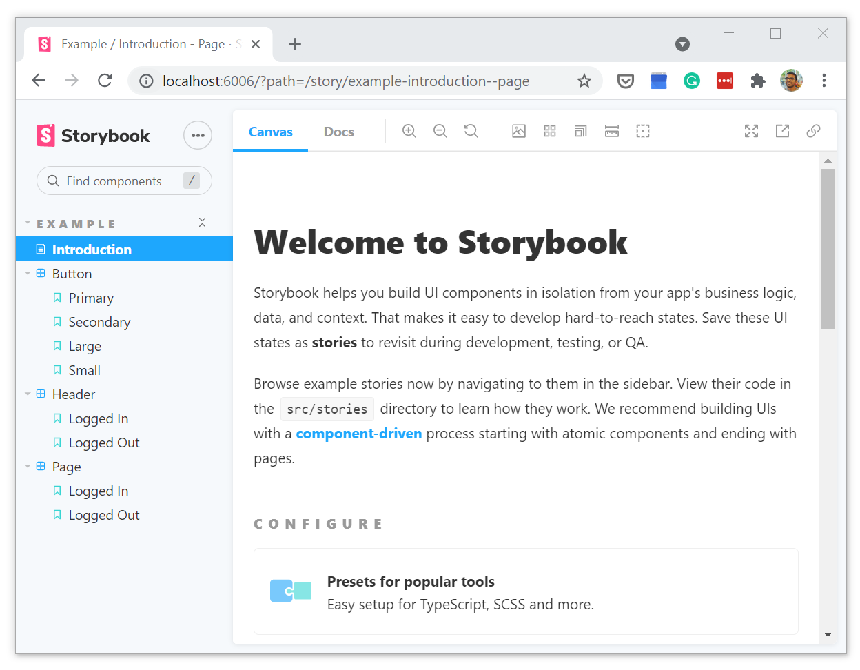
It should have opened http://localhost:6006/?path=/story/example-introduction--page in your default browser, and you must see stories over there as shown in the screenshot below.
4. Setup Angular Material
Let's set up Angular Material in the Angular app we created, and we will create a style guide (Stories) for the "<mat-progress-bar>" material component.
4.1 Install Angular Material
Run the below command to install Angular Material. You can find more info here.
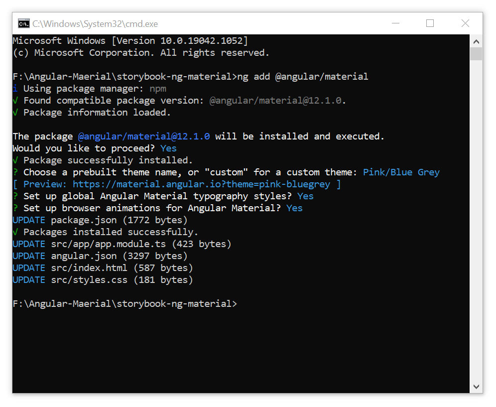
ng add @angular/material
Choose a pre-built theme, typography, and animation support through interactive command-line:
4.2 Create Progressbar component to render "<mat-progress-bar>"
Go ahead and create a simple component to render the Material Progress Bar component. This creates HTML, TS, CSS, and Spec.ts files.
ng g c progress-bar
Import MatProgressBarModule in App Module (app.module.ts)
import { NgModule } from '@angular/core';
.
.
import { ProgressBarComponent } from './progress-bar/progress-bar.component';

@NgModule({
  declarations: [AppComponent, ProgressBarComponent],
  imports: [
      BrowserModule,
      BrowserAnimationsModule,
      MatProgressBarModule
  ],
  providers: [],
  bootstrap: [AppComponent],
})
Add below piece of code to ProgressBarComponent (progress-bar.component.html)
<mat-progress-bar mode="indeterminate" value="40"></mat-progress-bar>
Render <app-progress-bar> in App Component (app.component.html)
Remove the default code created by ng CLI under app.component.html with the below code.
<div style="margin-top: 50px; padding: 50px;">
  <app-progress-bar></app-progress-bar>
</div>
Build and serve the Application
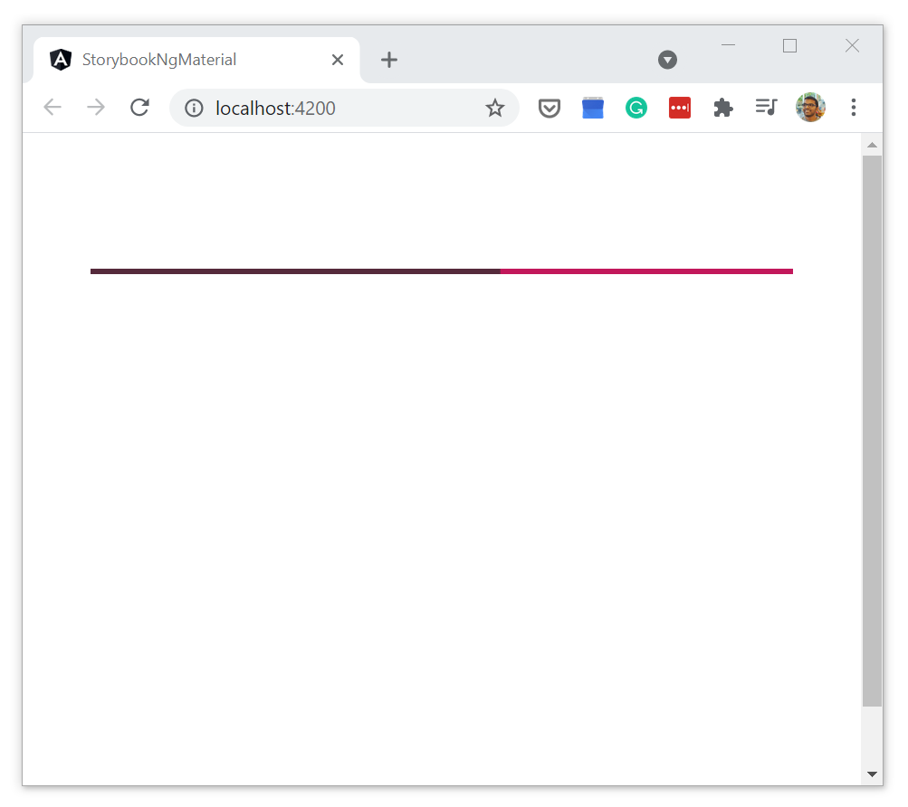
Run the angular application ng serve -o to see if the progress bar renders fine.
4.3 Add @Input() decorator to ProgressBar component to pass values
Okay, let's add @Input() decorator to ProgressBar properties, I am going to include all properties that are supported in Angular Material ProgressBar.
Add input properties in progress-bar.component.ts
import { Component, Input, OnInit } from '@angular/core';
import { ThemePalette } from '@angular/material/core';
import { ProgressBarMode } from '@angular/material/progress-bar';

@Component({
  selector: 'app-progress-bar',
  templateUrl: './progress-bar.component.html',
  styleUrls: ['./progress-bar.component.css']
})
export class ProgressBarComponent implements OnInit {

  constructor() { }

  ngOnInit(): void {
  }

  /**
   * ProgressBar mode - determinate | indeterminate | Buffer | Query
   */
  @Input()
  mode: ProgressBarMode = 'determinate';

  /**
   * ProgressBar Value (0 -100) - Applicable only for Determinate and Buffer modes
   */
  @Input()
  value: number = 40;

   /**
   * ProgressBar BufferValue (0 -100) - Applicable only for Buffer mode
   */
  @Input()
  bufferValue: number = 60;

  /**
   * ProgressBar Color - primary (Theme color) | accent | warn
   */
  @Input()
  color: ThemePalette = 'primary';

}
Add input properties in progress-bar.component.html
<mat-progress-bar
    [mode]="mode"
    [value]="value"
    [bufferValue]="bufferValue"
    [color]="color">
</mat-progress-bar>
5. It's time to write Stories
Create Stories TypeScript file under src/stories folder for ProgressBar component:
// Change directory to Stories
cd src\stories
// Create a new TypeScript file
touch Progressbar.stories.ts
Copy the below chunks of code (in the order listed) to the TypeScript file you just created. My explanation goes along with the code chunks.
Chunk #1 - Import statements
import { Story, Meta } from '@storybook/angular/types-6-0';
import { moduleMetadata } from '@storybook/angular';
import { ProgressBarComponent } from '../app/progress-bar/progress-bar.component';
import { MatProgressBarModule } from '@angular/material/progress-bar';
Chunk #2 - Create MetaData that gets consumed by Storybook
The default export metadata controls how Storybook lists your stories.
title- Title of the storiescomponent- The component namedecorators- Specify Module dependencies for the componentargTypes- This creates a radio button to play with the color of ProgressBar
Importing MatProgressBarModule helps in renderingthe MatProgressBar within ProgressBarComponent.
Remember to include other third-party modules as well under moduleMetadata to render the components belong to those modules.
export default {
  title: 'Angular Material/Progressbar',
  component: ProgressBarComponent,
  decorators: [
    moduleMetadata({
      imports: [MatProgressBarModule]
    }),
  ],
  argTypes: {
    color: {
      options: ['primary', 'accent', 'warn'],
      control: { type: 'radio'},
    }
  },
} as Meta;
Chunk #3 - Define a master template for ProgressBar stories
This template allows you to pass "args", basically the input properties of the ProgressBar component.
const Template: Story<ProgressBarComponent> = (args: ProgressBarComponent) => ({
  props: args,
});
Chunk #4 - Story for "Determinate" ProgressBar
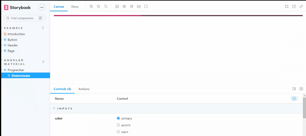
Let's create our first story for ProgressBar with mode 'Determinate'. It takes value and color properties as well.
This type of ProgressBar shows the determinate indicator in the value range (0 - 100).
export const Determinate = Template.bind({});
Determinate.args = {
  mode: 'determinate',
  value: 35,
  color: "primary" // primary | accent | warn
};
Play around by changing value and color to see how the ProgressBar renders.
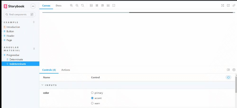
Chunk #5 - Story for "Indeterminate" ProgressBar
Similarly, create a story for ProgressBar with "Indeterminate" as its mode. No need to set the value since the ProgressBar is not having "Determinate" indicator (0 - 100).
export const Indeterminate = Template.bind({});
Indeterminate.args = {
  mode: 'indeterminate',
  color: "accent" // primary | accent | warn
};
Change the ProgressBar color from controls in StoryBook and see how that looks.
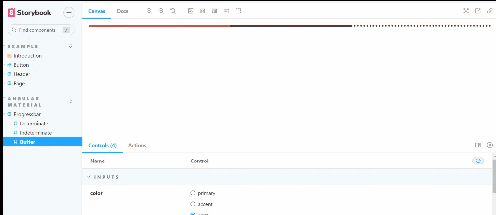
Chunk #6 - Story for "Buffer" ProgressBar
This type of ProgressBar is used to indicate some activity or loading from the server.
We need to pass value for mode, value, bufferValue, and color properties.
export const Buffer = Template.bind({});
Buffer.args = {
  mode: 'buffer',
  value: 35,
  bufferValue: 65,
  color: "warn" // primary | accent | warn
};
Change the bufferValue and see how it reflects in the ProgressBar.
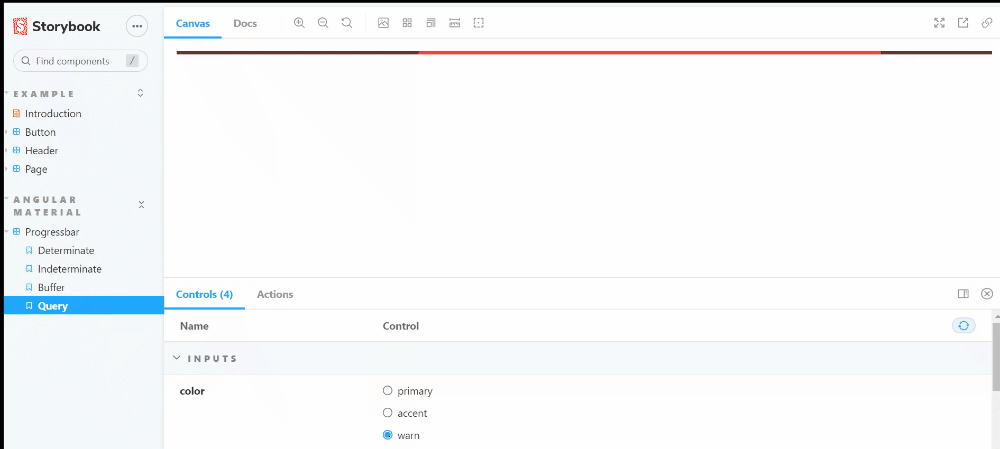
Chunk #7 - Story for "Query" ProgressBar
Okay, the final story that's going to render ProgressBar in "Query" mode. This is often used to indicate "Preloading" before the actual loading starts.
export const Query = Template.bind({});
Query.args = {
  mode: 'query',
  color: "warn" // primary | accent | warn
};
Play with the color and see the change on ProgressBar.
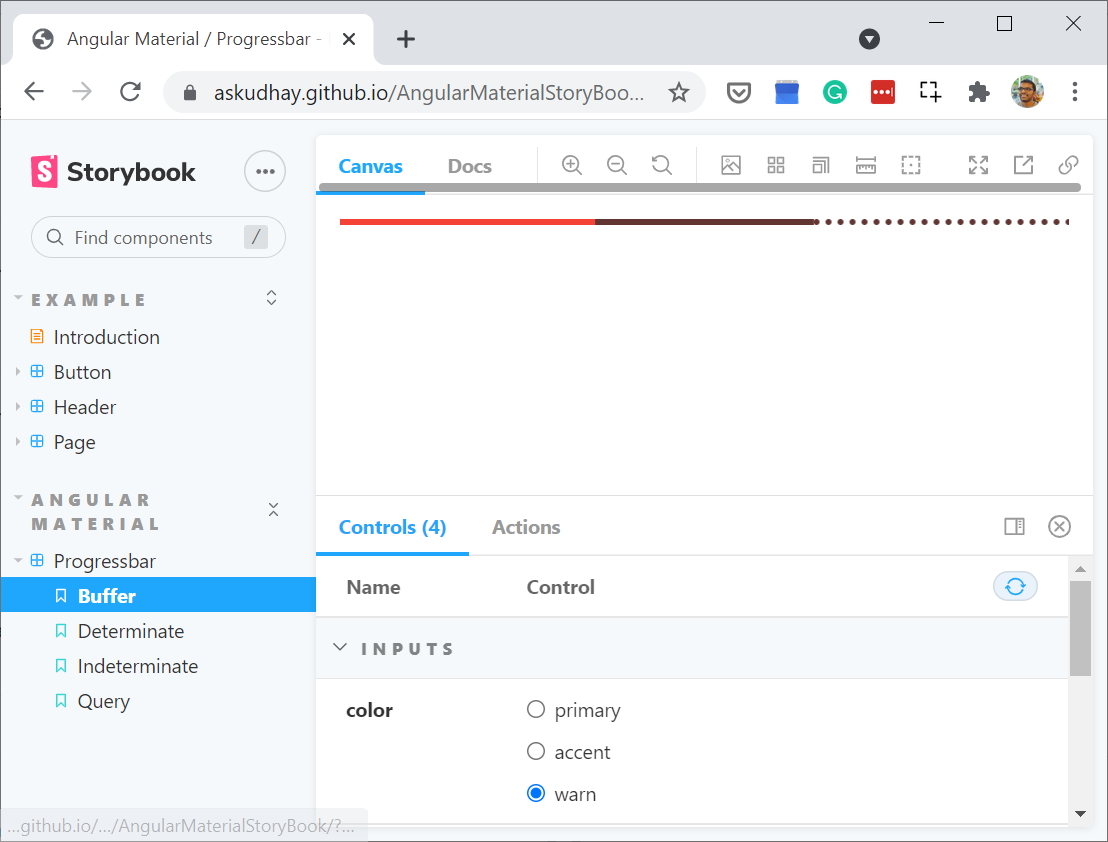
6. Live Demo
I deployed this example as a static website in GitHub Pages.
7. Grab the code from GitHub
I just checked in the code to GitHub, you can either download or clone to work on this example further.
If you got any questions, feel free to post them in the comments section down below.
Happy learning!
I tweet a lot about Web development, Java, and Productivity Hacks, so feel free to follow me on Twitter at AskUdhay.
Here is one of my recent tweets:
Further Reading
- My recent talk on creating Style Guide for an Angular application using StoryBook.js


